App Builder
Summary
View Live Prototype on Figma »
View Full Case Study Presentation on Google Slides »
The No-Code App Builder, designed in Figma, aimed to create a user-friendly native app that empowers business owners and managers to make work easier by developing custom business applications directly from their mobile devices, without the need for coding expertise or assistance from developers.
Over a span of two weeks in February 2023, I led the UX design process, from initial concept to usability testing, ensuring a seamless and intuitive experience for the users.
The Problem:
Small business owners and managers often lack the time and expertise to swiftly grasp the intricacies of creating customized workflows using specific apps or tools, such as project management software. They may become overwhelmed by the multitude of features, limitations, and differences across various software platforms. The absence of user-friendly customization options and automation capabilities within these tools further adds to their frustrations. Users desire a more intuitive and streamlined approach to customize apps according to their unique workflows and automate processes, without requiring extensive technical knowledge.
Target Users:
Business owners, managers, team leaders
The Goal:
Explore the concept of a no-code app builder that will:
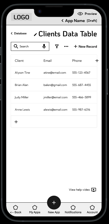
- Allow users to quickly build and edit custom business apps for their specific workflows and manage their data from their mobile devices.
- Reduce users’ overwhelm and tedium with technology, collaboration, and communication, and make these simpler and fun.
Role: UX Designer
Tools: Figma, Figjam
Duration: 2 Weeks, Feb 2023
Research and Empathizing
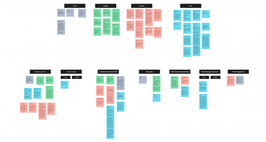
During the research phase, I employed a variety of methods to gain deep insights into the target audience and their needs. Through user interviews, I conducted one-on-one sessions with business owners and managers to understand their pain points, challenges, and expectations when it came to creating custom business apps.
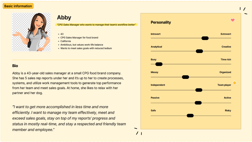
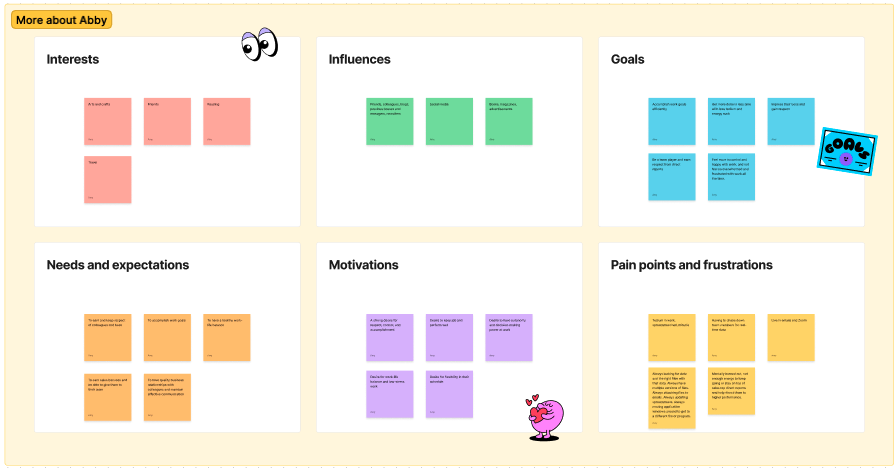
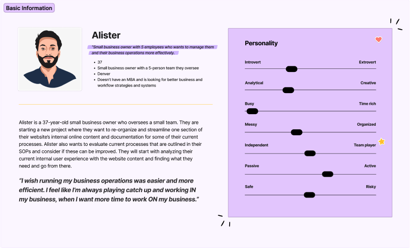
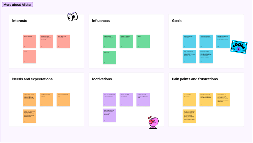
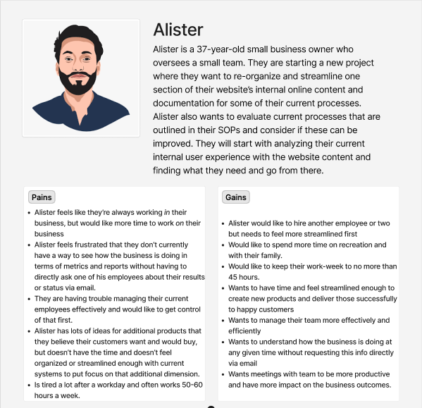
I also explored empathy maps, personas, user journey maps, and more to better empathize with target users.
The research findings played a crucial role in shaping the subsequent design decisions. By understanding the users’ goals and preferences, I was able to create a user-centered design that met their specific requirements, discussed in more detail below.
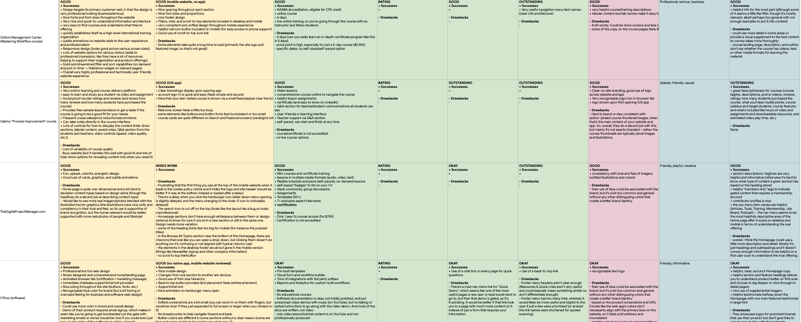
The research phase also included competitive analysis, where I studied similar app-building tools to identify industry trends, best practices, and areas of opportunity.
Ideation
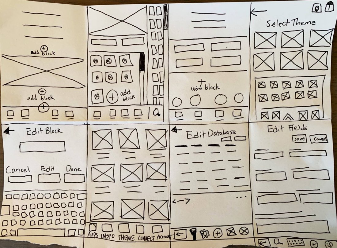
The ideation phase involved brainstorming and generating concepts for the No-Code App Builder, starting with reviewing notes from my initial research and making a list of features the app should and could include to meet user needs. I moved from there to rapid sketching with Crazy Eights exercise.
Through iterative ideation, I refined concepts and identified the most promising solutions.
My focus was specifically on the following:
- An intuitive interface for a native app
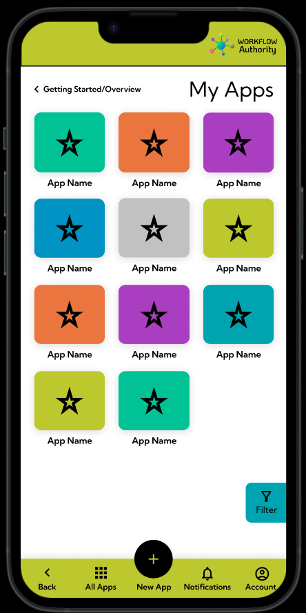
- Easy navigation between the different sections
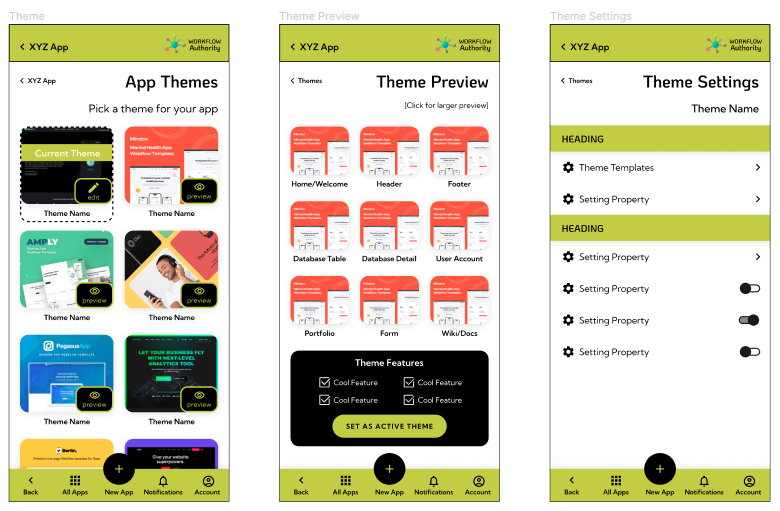
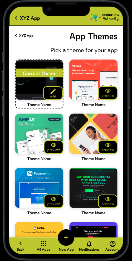
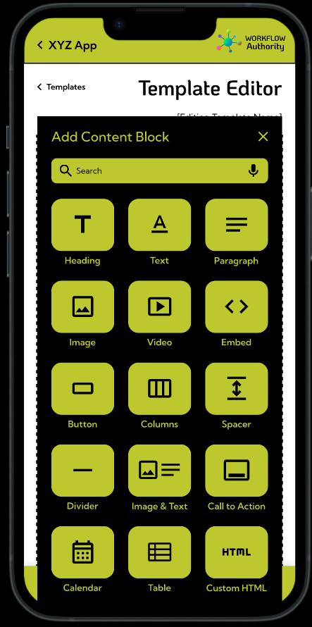
- Themes to make it easy to get started with app creation
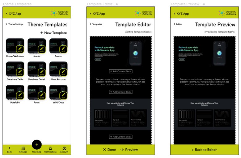
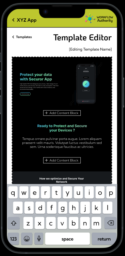
- Simplicity in editing theme templates
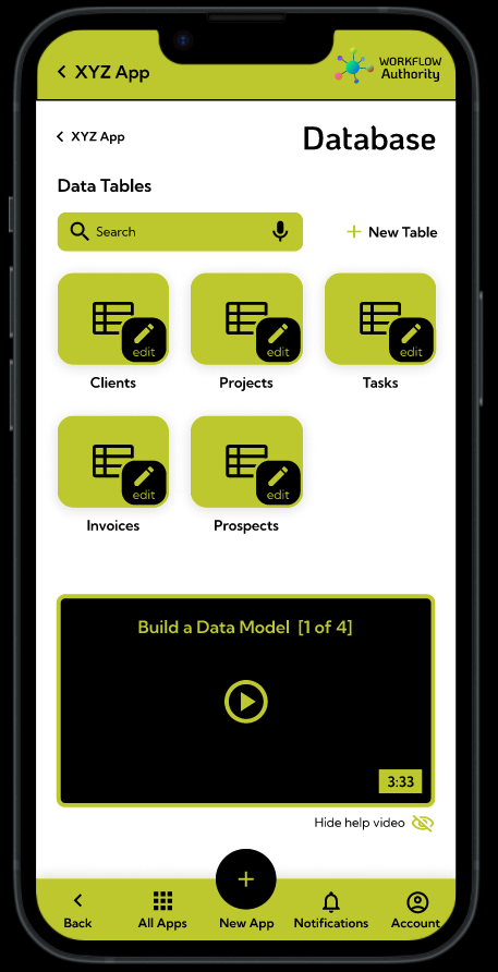
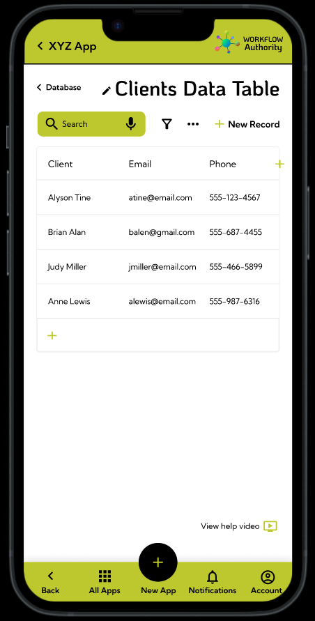
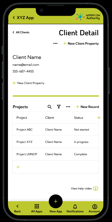
- A straightforward way to customize an app’s database and manage data
Design
Low-Fidelity
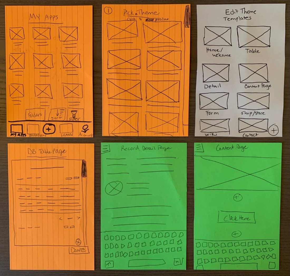
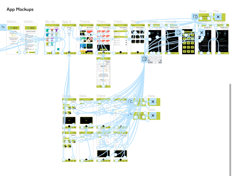
The design phase involved transforming the ideation concepts into tangible visual designs. I began by creating low-fidelity wireframes using Figma to define the app’s information architecture, layout, and flow. These wireframes acted as a blueprint for the subsequent design iterations.
High-Fidelity
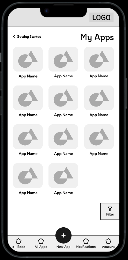
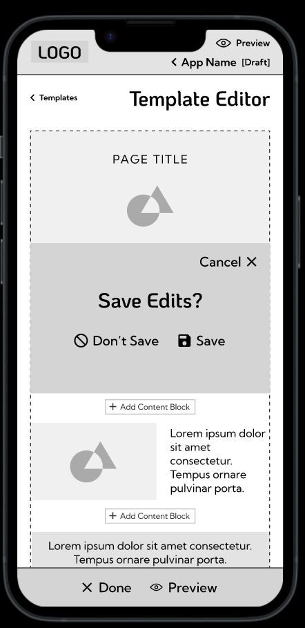
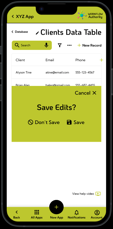
I then developed high-fidelity mockups that incorporated the brand identity, visual hierarchy, and interactive elements. I carefully considered user interface components, color schemes, typography, and iconography to ensure a cohesive and aesthetically pleasing design. Throughout the design process, I adhered to usability principles, ensuring that the app was intuitive.
Evaluation
Through the testing process, we identified areas where users encountered difficulties, confusion, or bottlenecks. I paid close attention to navigation, clarity of instructions, and the overall user flow. The findings from the usability testing sessions helped to uncover pain points and make informed design decisions.
Based on user feedback, we iterated on the design, refining and optimizing the app’s interface and user experience. We made adjustments to improve the onboarding process, clarified certain features, and simplified complex interactions. Usability testing served as a valuable feedback loop, ensuring that the final design met the users’ needs and expectations.
Reflection

Throughout the No-Code App Builder project, significant milestones were achieved in creating a user-friendly app creation tool. The intuitive interface and simplified workflows received positive feedback during usability testing. However, I encountered challenges in balancing customization options with ease of use.
In future iterations, it would be beneficial to explore more advanced features to accommodate users seeking greater customization, user-test the in-app video tutorials, and focus more on accessibility concerns for users in under-represented groups.
Overall, this project provided valuable insights into the needs of non-technical business owners and managers and the importance of empowering them with simple app development tools, especially on their mobile devices.
Impact
Users shared that the app made creating and editing custom content and data from a phone easier than it has been for them using other apps. One quote from user feedback was “I like that there are starter data tables in the database already to give you an idea of what you can do and an easy place to start.” Another user said, “It’s nice to not feel overwhelmed with too many options. I like that it’s simple.”
What I Learned
I learned that even when you may think that you’ve simplified a design, you can probably make it simpler. Prioritizing just the essentials helps you maximize the value of the elements on the screen, but you still need to be careful to not strip away too much. Users need the right cues at the right times. They need access to off-screen features in the fewest clicks possible. Consistency is also crucial, in visual, in flow, in motion, and more. In the smallest interactions, consistency is key for delivering intuitive user experiences.

