DIY Website
Summary
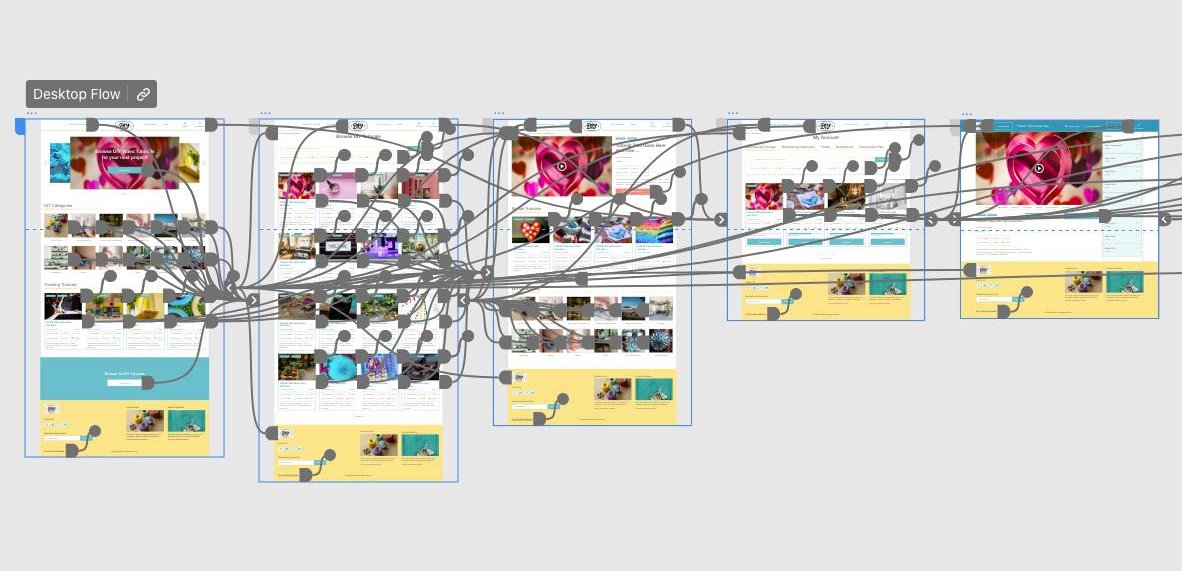
View High-Fidelity Prototype on Adobe XD »
View Full Case Study Presentation on Google Slides »
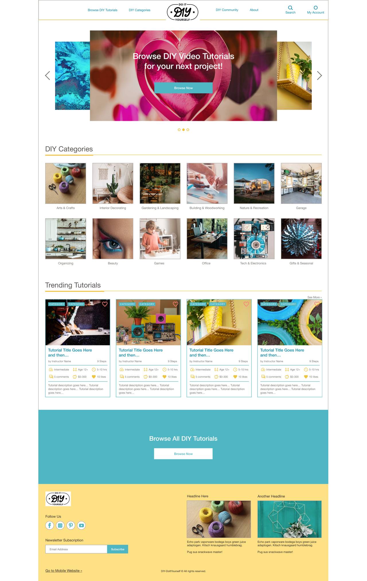
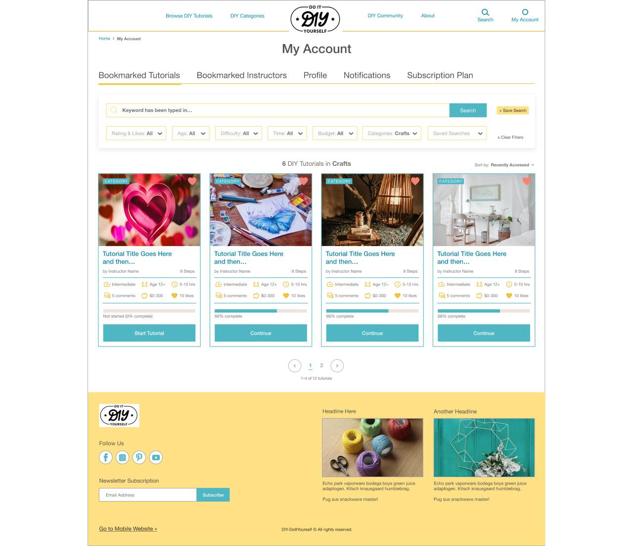
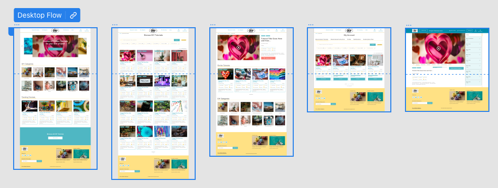
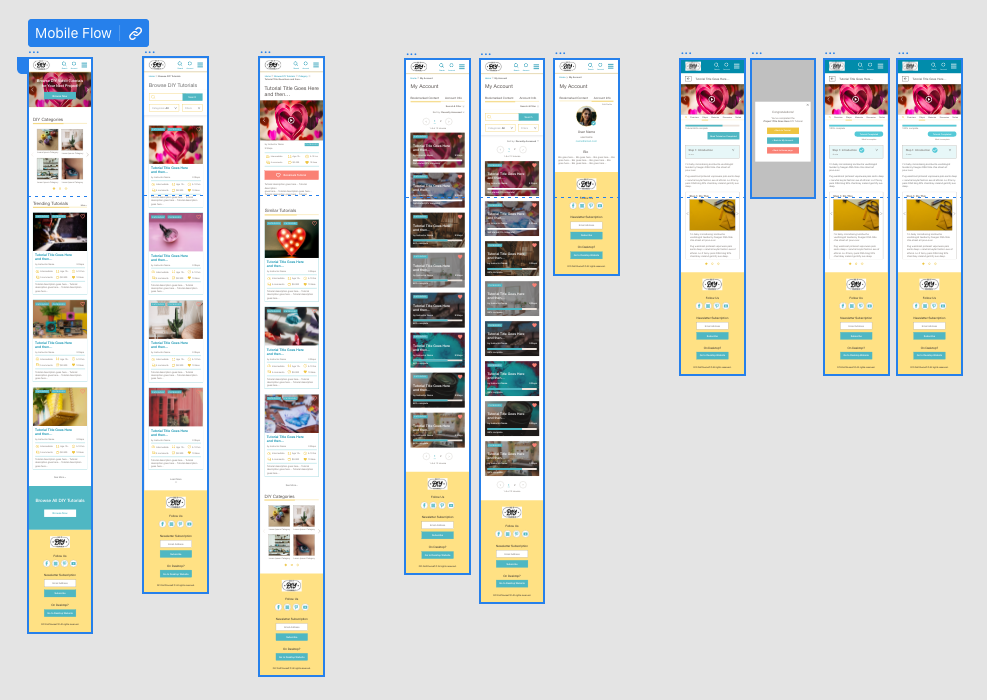
DIY (Do It Yourself), designed in Adobe XD, is an initial concept for a responsive website that provides an online hub for DIY enthusiasts to browse, filter, and follow along with high-quality DIY video tutorials, as well as keep a personalized account for saved DIY projects, notes, and messages.
The Problem:
DIY enthusiasts have a strong desire to engage in various projects and seek high-quality tutorials to guide their endeavors. However, a competitive audit revealed shortcomings in existing DIY websites:
- Inadequate Search and Filter Options: The majority of DIY websites lack a robust search and filter system, making it challenging for users to efficiently find relevant tutorials based on their specific interests or preferences.
- Insufficient Metadata: Many DIY websites fail to provide helpful metadata, such as difficult level, amount of time needed, age level intended, budget for supplies and materials, etc., which hinders users in discovering tutorials that align with their specific project requirements or skill levels.
- Lack of Standardized Tutorial Format: A significant portion of DIY websites do not adhere to a standardized tutorial format, resulting in inconsistent experiences for users. This inconsistency makes it harder for individuals to follow along and replicate projects effectively.
Given these observations, there is a clear opportunity to address these limitations by creating a DIY platform that offers a robust search and filter system, incorporates informative metadata, and establishes a consistent and user-friendly tutorial format. By addressing these gaps, the DIY website can provide a valuable resource for DIY enthusiasts, enhancing their experience and facilitating their exploration of various projects.
Target Users:
DIY enthusiasts, parents, teachers
The Goal:
Explore the concept of a DIY Responsive Website that will:
- Help DIY enthusiasts search and filter DIY project tutorials for their own projects
- Provide a consistent tutorial format and metadata points for comparing and evaluating tutorials
- Streamline the DIY project experience and make browsing tutorials and learning from them more enjoyable
Role: UX Designer
Tools: Adobe XD, Miro
Duration: 5 Weeks, Nov-Dec 2022
Research
Interviews and Empathizing
I conducted interviews with participants from the target demographic (DIY enthusiasts, people who enjoy projects for home improvement, electronics, arts, crafts, and more) to understand common pain points when searching for DIY tutorials online.
Most participants reported feeling:
- Overwhelmed by too many unrelated websites or forums to search through
- Annoyed by too many different tutorial styles or formats to quickly evaluate quality and relevance
- Frustration and confusion at not having one single website where they could search and filter tutorials and trust that all would be high-quality and have a consistent format
- A desire to have a way to save notes about projects or materials.
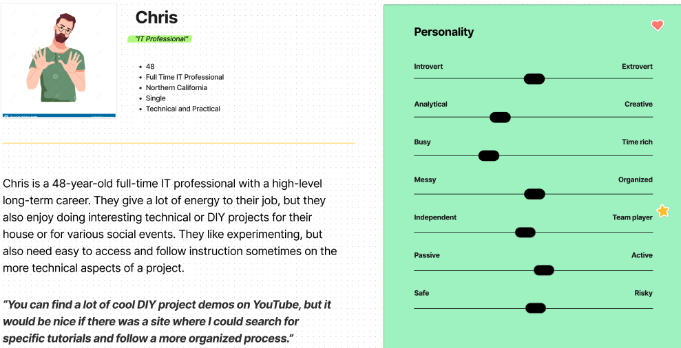
I created personas based on these themes and target user demographics.
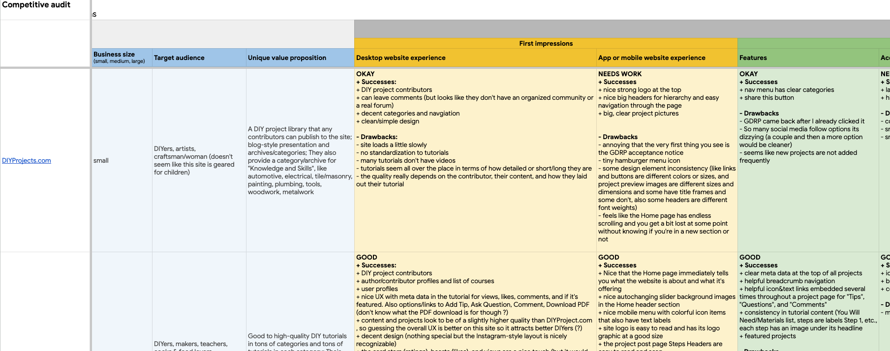
Competitive Audit
A competitive audit revealed additional opportunities for the product concept:
- Five out of six competitors don’t offer a standardized, consistent format for their tutorials
- Four out of six competitors’ tutorials are low quality
- Five out of six competitors don’t provide robust search, filter, and metadata features
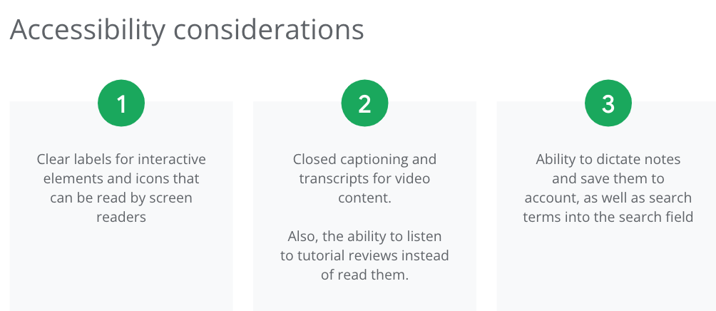
- Five out of six competitors don’t have accessibility features, like closed captions for videos, text-to-speech or listening options for text content
While existing DIY websites offer some of these, they either don’t do it well or consistently or don’t provide all of these features. So the opportunity to do so exists.
Ideation
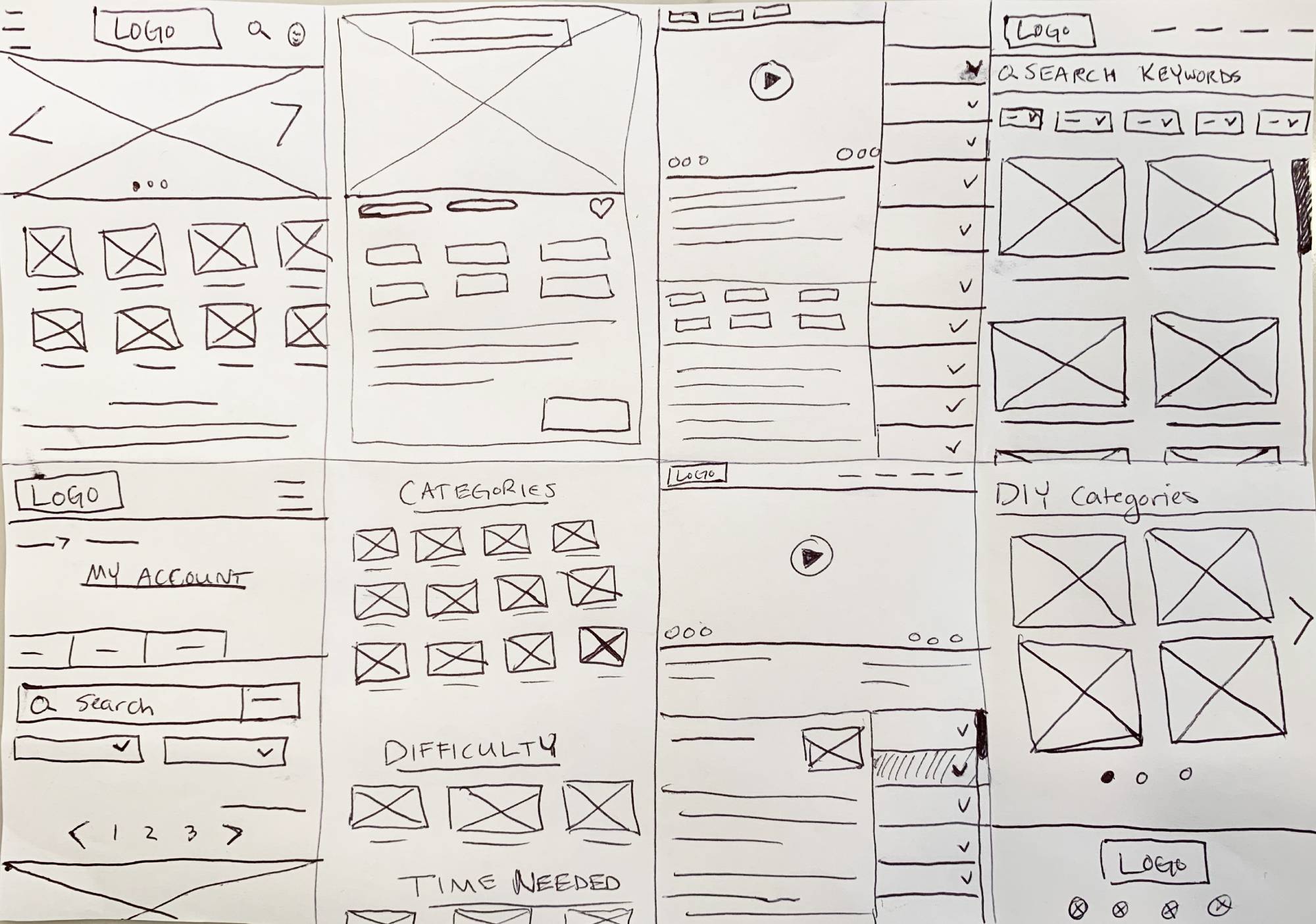
The ideation phase involved brainstorming and generating concepts for the DIY website, starting with reviewing notes from my initial research and making a list of features the website should include to meet user needs. I moved from there to rapid sketching.
Through iterative ideation, I refined concepts and identified promising solutions.
When ideating, I was specifically focused on:
- Layout ideas for tutorial categories
- An intuitive interface for the tutorial learning content
- Search field placement and layout for search results
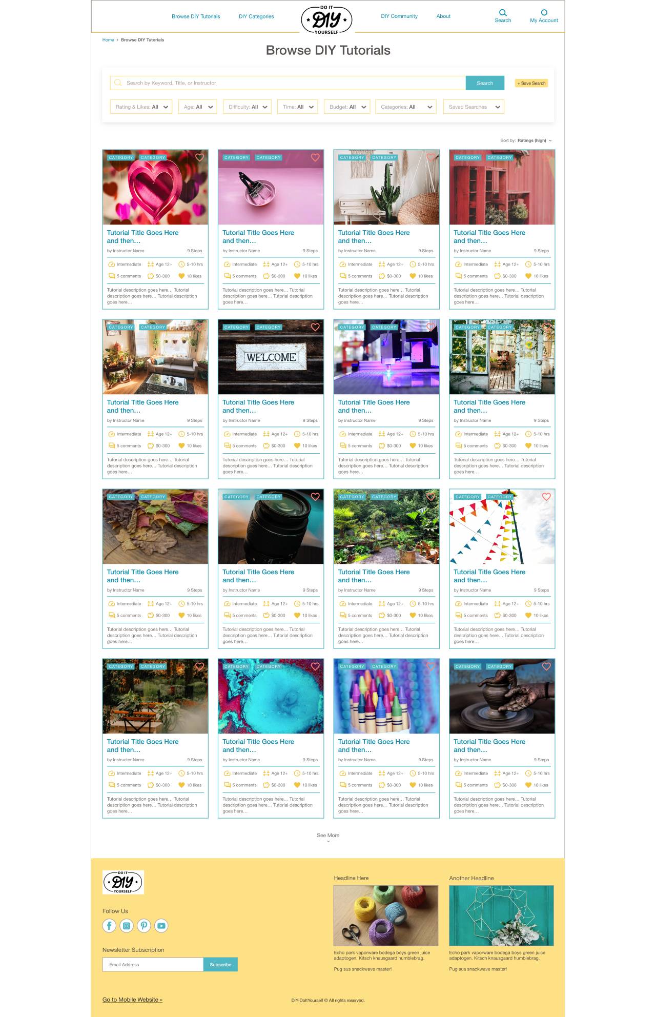
- Helpful ways to browse and filter tutorials
Design
Low-Fidelity
After ideating and drafting paper wireframes, I created initial designs for the DIY website.
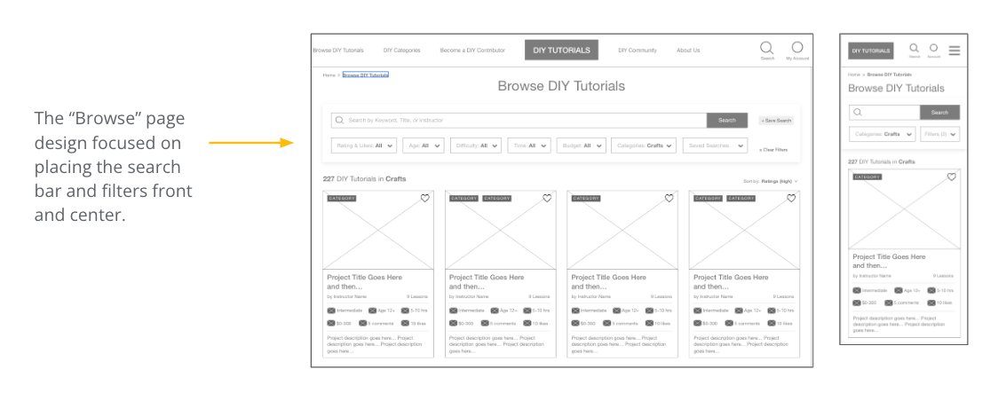
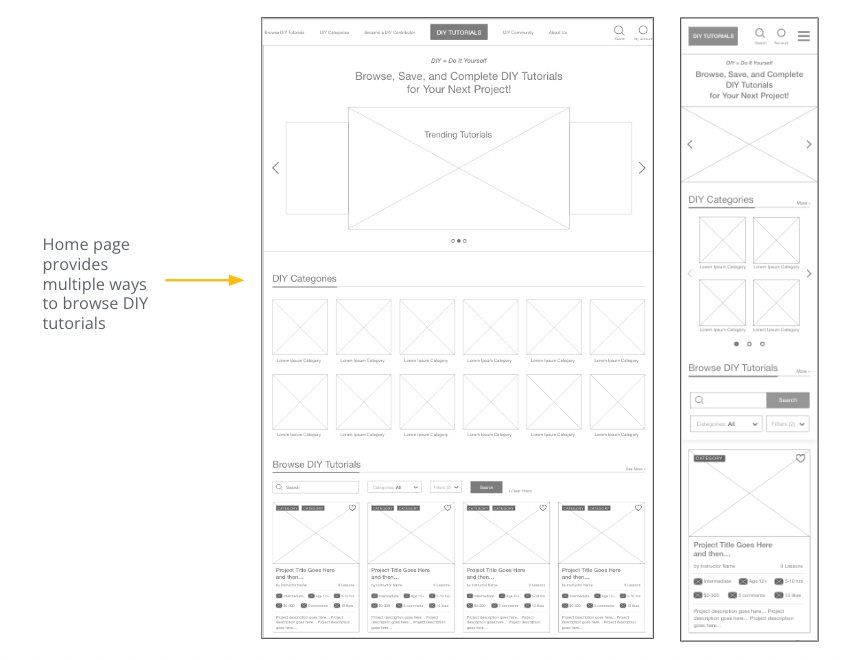
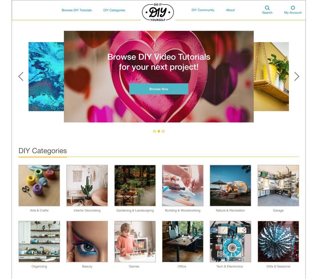
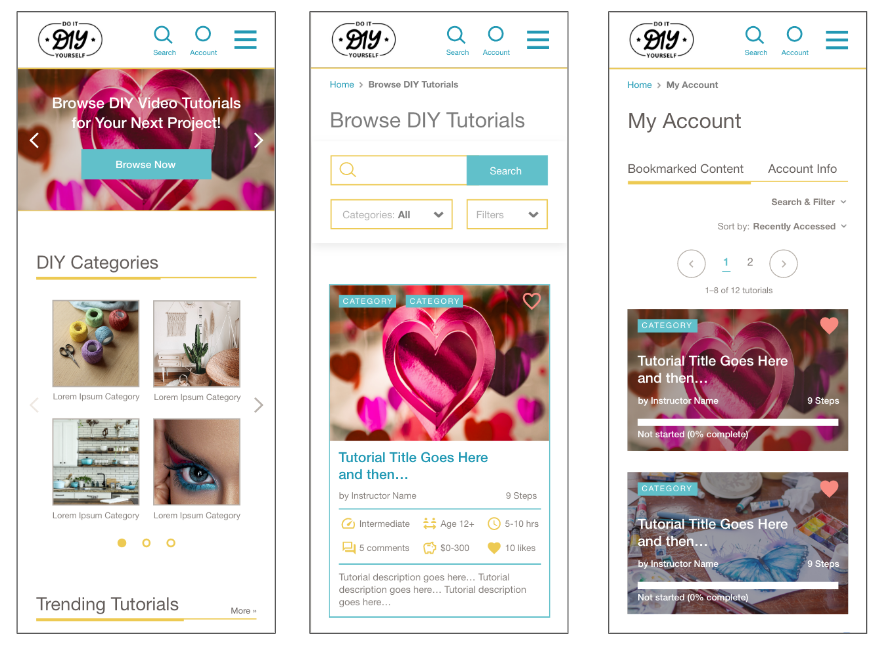
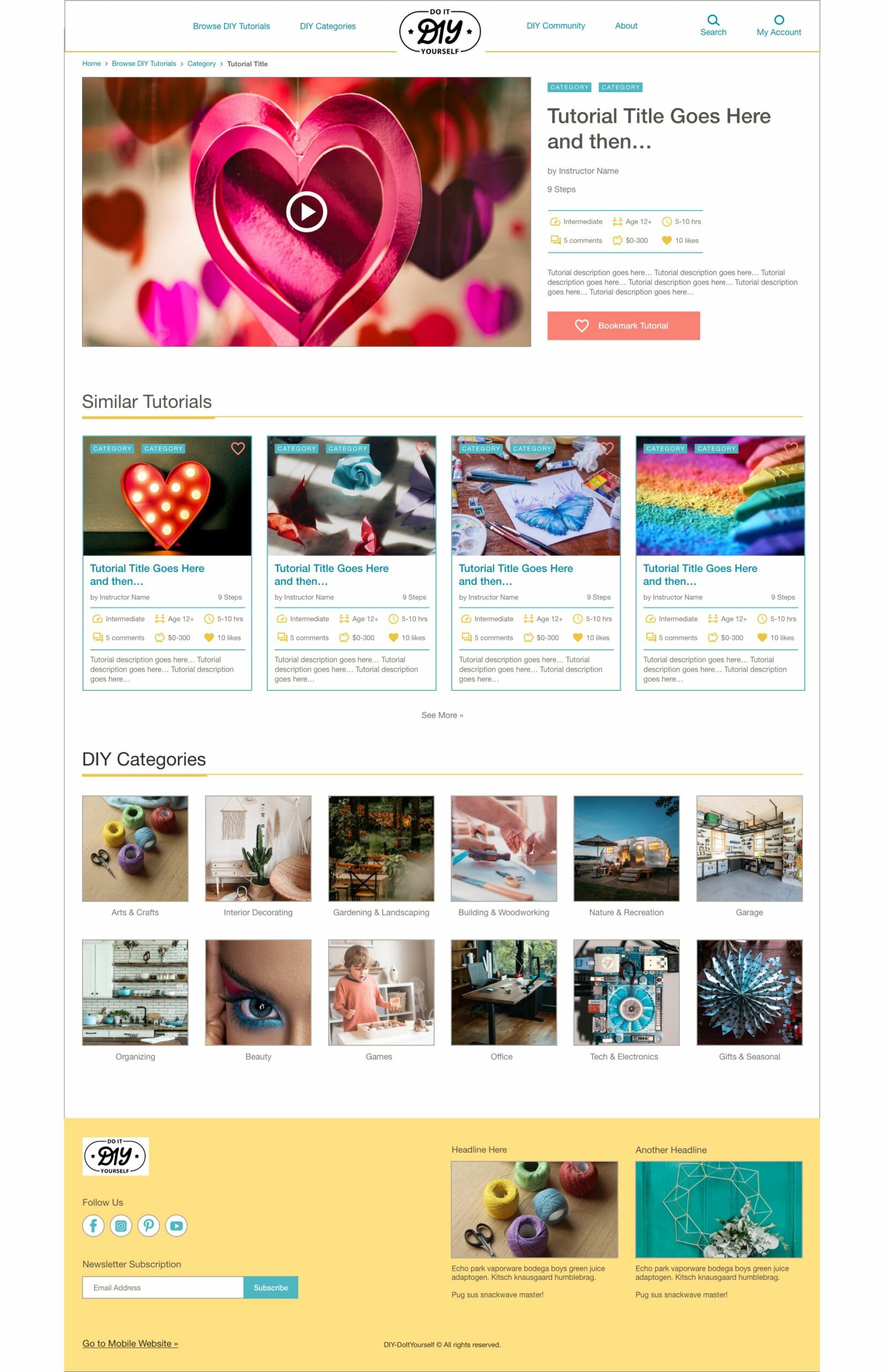
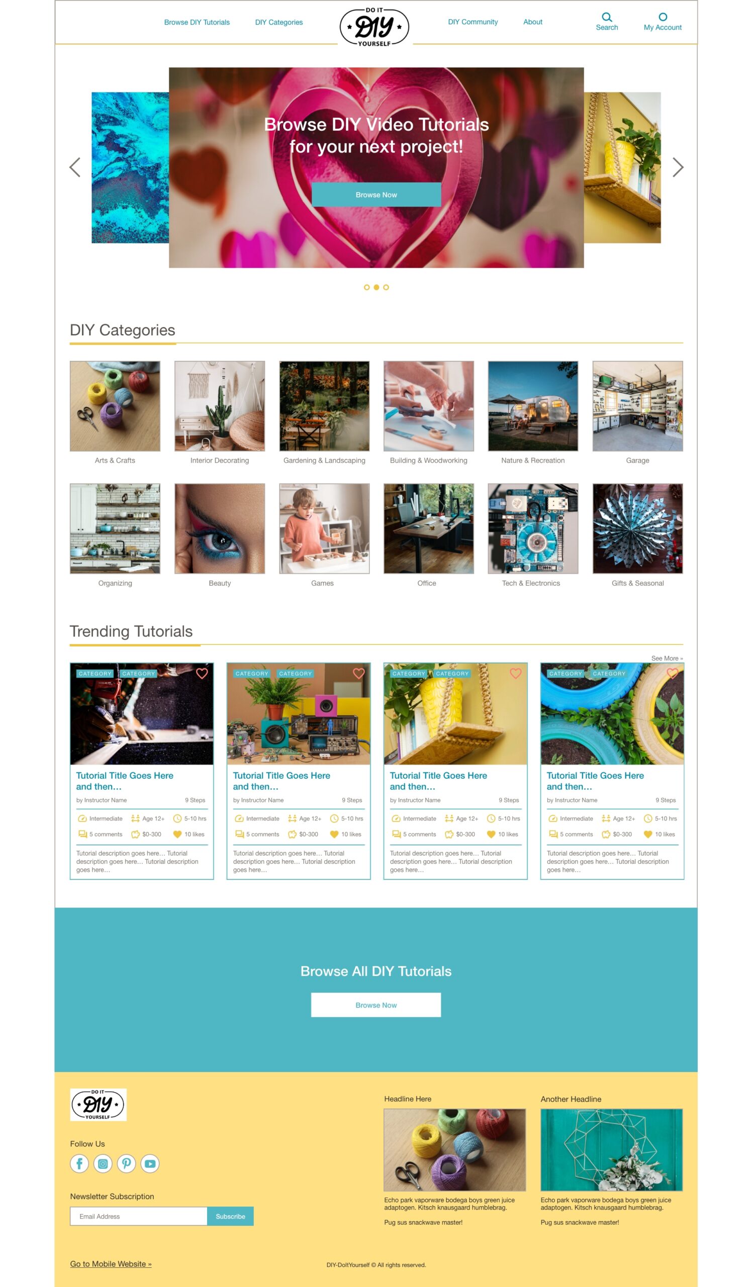
These designs focused on clear sections with multiple ways to browse DIY tutorials from the Home page, along with a tutorial preview card design that showcases the tutorial’s thumbnail image, metadata, categories, and short description.
Wireframe Iteration
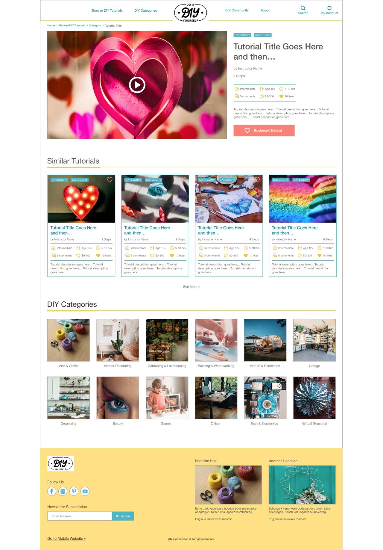
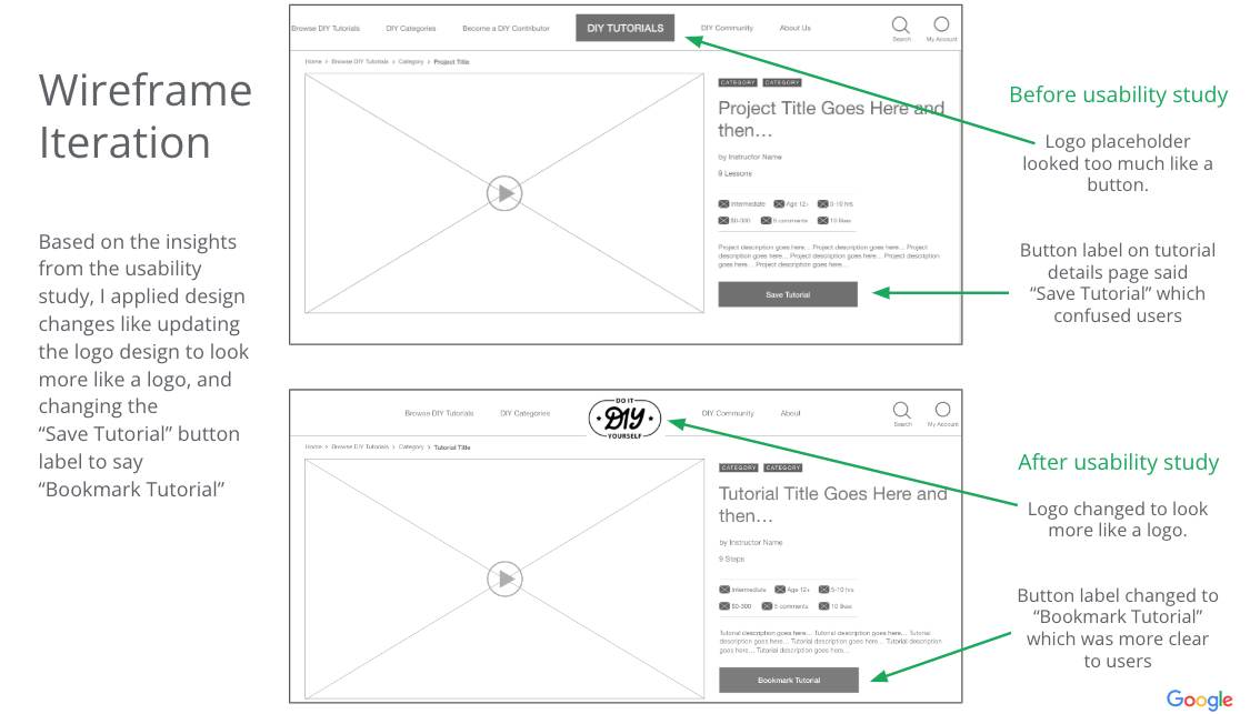
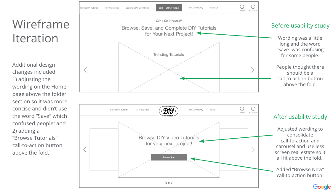
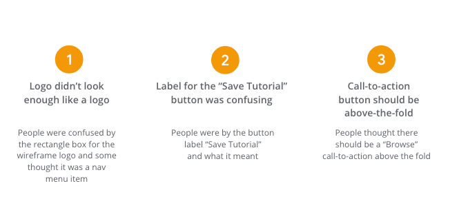
Based on the insights from the usability study, I applied design changes like updating the logo design to look more like a logo, and changing the “Save Tutorial” button label to say “Bookmark Tutorial”
High-Fidelity
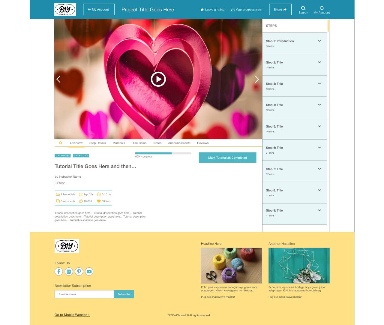
For the high-fidelity mockups, I prioritized a playful visual design using vibrant images and color and made sure to keep the search and filter functionality and categories easily accessible to help users quickly find DIY tutorials that match their interests and needs.
My focus was specifically on:
- Making the tutorial search and filter experience central to the user flow
- Robust tutorial metadata for filtering and evaluation
- A standardized tutorial format
- Consistent interactivity and learning experience on the tutorial page
- Fun and playful visual design and high-quality imagery
Evaluation
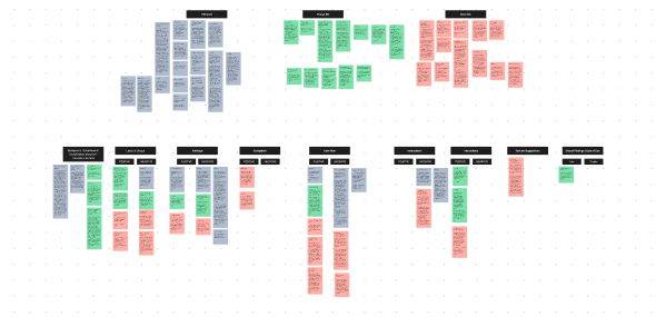
I conducted a usability study with a low-fidelity prototype. Findings from this study helped guide the designs from wireframes to mockups. I synthesized the data, using an affinity diagram to group themes. After completing mockups with revisions based on insights gathered from the usability study, I created a high-fidelity prototype, which could be used for additional usability studies.
Reflection
DIY (Do It Yourself) Website Project: Milestones were achieved in creating a responsive website tailored DIY enthusiasts. Future iterations should refine the primary flow of browsing and bookmarking tutorials and explore additional flows, like onboarding and walkthroughs for tutorial contributors. Prototypes should be tested with users to better meet their needs.
Additional accessibility features might include a voice dictation button in the search field, tutorial video closed captioning and transcripts, language translation, and customizable personal settings.
This project offered insights into providing DIY enthusiasts with an enjoyable and helpful experience for browsing and learning from DIY tutorials.
Impact
Users shared that the app was beautiful and inviting and felt well-matched visually for a DIY project experience. They liked the search and filters being easily accessible and front and center and appreciated the content shown on the tutorial preview cards. One quote from user feedback was “I like that they [the tutorial cards] have a bunch of information about the courses.”
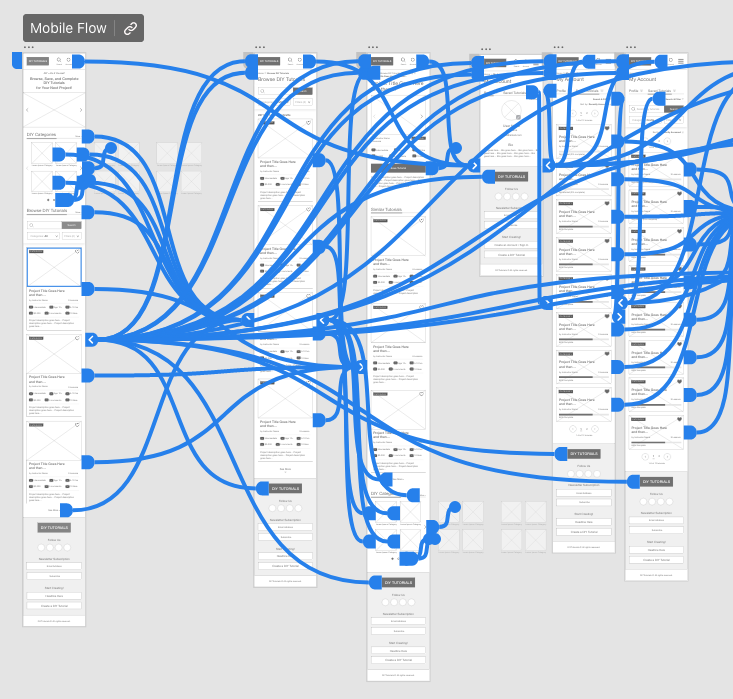
Users generally appreciated that the website could be used seamlessly across multiple devices without losing options or content.
What I Learned
I learned that it can be fun empathizing with users and making their experience with your product more useful and enjoyable for achieving their goals.
I learned that for certain types of content, metadata strategy becomes quite crucial. If your product’s usefulness weighs heavily on the ability to filter content or data in various ways, spending extra time upfront researching and empathizing with users’ needs for this specific aspect of the flow can allow for earlier testing with real users for this crucial feature and save time on design iteration.

